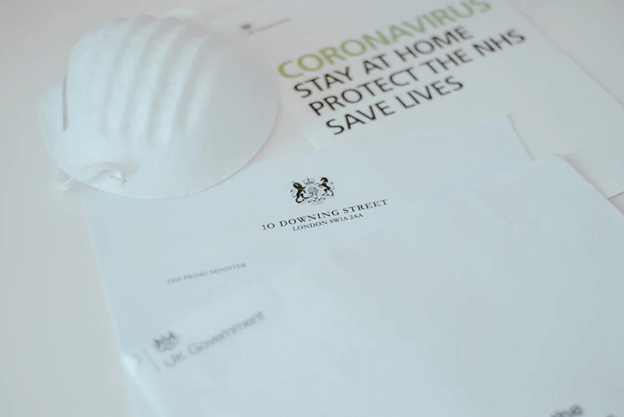
Even before the coronavirus disease 2019 (COVID-19) became a global threat, patient education has been a principal concern in any clinic or medical facility. However, according to research, patients often forget verbal guidance from their doctors. With this in mind, healthcare professionals look for additional ways to make sure patients follow orders, like traditional pamphlets
As the coronavirus that causes COVID-19 continues to evolve rapidly, it can be challenging for medical practitioners to educate their patients on proper health protocols. Fortunately, medical brochure templates still come in handy, in this time of the pandemic. A well-designed brochure can complement a physician’s instructions.
This article will share creative tips on using brochure templates to design information materials that can effectively educate your patients about COVID-19. Whether you’re a doctor and are a beginner in graphic design or a pro by now, we will take you to a step-by-step tutorial.
But, first things first, let’s talk about the importance of medical brochures.
A well-designed brochure can break down complicated information into easy-to-read content. Provided that the content in the brochure or flyer is relevant, colorful, and organized, these single-page information materials can help patients remember instructions even after they leave the doctor’s clinic.
Also, it can save valuable time for doctors and patients; it’s not all the time that patients understand what their doctors tell them. But with accurate images and texts, doctors won’t receive a lot of questions down the line. Remember, given an ongoing virus threat, people are encouraged to spend less time and exposure outside.
What’s more, these pamphlets can be carried around or kept in pockets. Patients can easily pull these out of their pockets or bags to remind themselves of the basic health protocols to avoid contracting any infectious viruses in homes and public spaces.
Now, here are the tips to ensure that your medical flyers are effective and well-designed.
Contents
Use less text and more visuals.
Either tri-fold or half-fold, a good brochure will always include infographics. Why? People recall almost 65% of the visual content that they see, according to studies.
For instance, you would want to convince your patient how essential vaccines are during this pandemic. The best way to attract their interest is to highlight numbers, minimize text, and let visuals drive your copy.
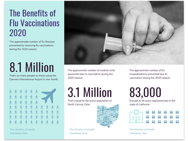
The image above presents the benefits of flu vaccinations by listing the number of people who received the shot as well as the number of medical visits and hospitalizations that were prevented in 2020. The design is simple, but it shows the impact of the vaccinations at a glance.
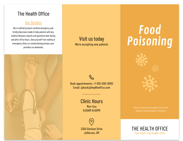
Create an engaging cover.
Let’s face it; nobody picks up a book with a dull cover. The same holds with the brochures that are stacked on tabletops and counters inside an office or clinic. Therefore, pick a brochure design that looks engaging enough for patients to grab and read.
You need a big image and less text on the cover page; one line about the brochure is enough. For some, designers include their contact information and logo to build trust and credibility with their readers. Take the example below as your reference when creating a cover page for your brochure.

The cover shows a large image of a man holding his head to depict mental illness. This gives the audience an idea of what kind of content to expect inside the brochure.
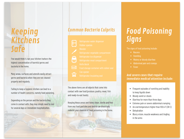
Be consistent.
Being consistent is a rule of thumb for almost everything — relationships, presentations, graphic design, and whatnots. Make sure that your font style and color, icons, and images look consistent throughout the whole flyer. More so, if your clinic logo or brand already has its color, make sure that it also matches the design in your infographic. If your brand colors are purple and grey, there’s no justification for using red and orange in your brochure.
The same goes with the typeface; there’s no reason you should be using Arial if your brand’s text uses a Times New Roman. On that note, see this template example below that practices consistency from cover to cover.
Print bigger and high-quality brochures.
As mentioned above, people tend to look past brochures and ignore dull-covered flyers. So in a rack of brochures, make sure that your infographics are distinguishable by printing them on high-quality and large pieces of paper. While most print their pamphlets using 8.5 x 11 inches paper, invest in an 11 x 17-inch or 9 x 16-inch sheet.
An alternative is to print on card stock. In this way, the paper feels more sturdy in the hands, and it lets your readers know how serious your medical practice is against the spread of the disease.
Do your best to exercise these tips when creating an infographic about healthcare. Not only will it be a brand-consistent brochure that educates patients, but it will also differentiate your practice and reputation as a health expert. If you need help creating a medical brochure without starting from scratch, Venngage has editable templates that are free and downloadable!